Overview
CHALLENGEDevelop a new product, design and build a new parking booking website and create a new brand in 3 months with full booking, payment and 'My Account' functionality.
|
ROLELed the UX/UI design of the website, conducted usability testing through to deployment, developed a new Figma design system and led the creative direction of the brand.
|
Solving the Problem
PARKERAs a parker, I want to search and compare the best parking deals, book and pay all in the one site, save money, time and feel assured that my payment details are safe and secure.
|
LISTERAs a lister, I want an extra sales channel for my business that's easy to set up so I can list new parking sites, manage and track my sales and expand my customer base.
|
Note: This case study explores the research, design, iterations and results for a parker (customer) only.
Finding a Solution
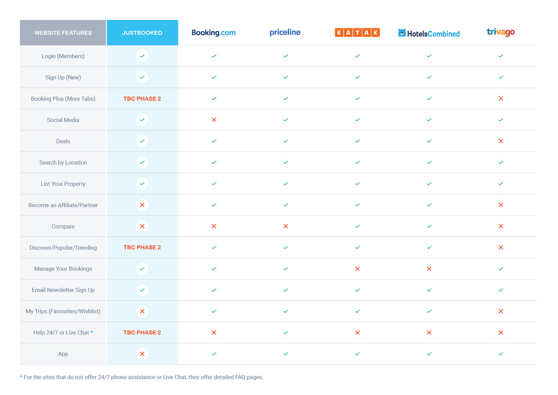
Above: Competitor analysis table comparing Justbooked's phase 1 features with popular booking sites.
COMPETITOR ANALYSISTo validate the MVP, I compared features that were prioritised for the product launch with popular features that appeared on other top booking sites to see how Justbooked compared.
ResultsJustbooked only had 50% of the top features that appeared in top parking booking sites. I recommended that those missing features be prioritised for the next phase along with data to validate them as prioritised features to ensure user's needs and expectations would be met.
|
CUSTOMER FEEDBACKBased on customer feedback that I gained from existing products, as well as conducting user interviews with stakeholders, I used those insights to validate pain points customers had while trying to book parking online.
ResultsTop pain points included booking details not being clearly visible and unclear parking instructions. By improving the visual hierarchy, ensuring instructions on how to park and exit were clearly visible and easy to understand (tested with users) and adding photos of parking site entries, resolved these issues.
|
Key Deliverables
|
Above: Desktop wireframes of the homepage – iteration 4 of 4
|
WIREFRAMESAs there was limited time to create site maps and user flows, I used the wireframe walk through to show the dev team the information architecture and how the user flows would work across desktop and mobile wireframes.
FeedbackBased on tech feedback that building a Start and End Time couldn't be built by launch, I removed this functionality, kept Start and End Date, then led a final walk through with senior stakeholders for final sign off to start the build of the website.
|
Developing a New Brand
Once the wireframes had been handed over to the dev team, my next step was to build out the Justbooked brand, create a new Figma Design System, develop a UI look and feel and apply it to the desktop and mobile screens.
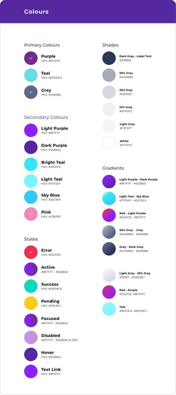
Based on simple brand logo assets that were supplied by an agency, I had to further develop all other brand elements, including the Justbooked look and feel, tone of voice, defining the visual hierarchy of heading body copy fonts, form elements and rules, creating colour swatches, icons, vector scenes and worked closely with my UX team to roll out all UI elements across all desktop and mobile screens.
Based on simple brand logo assets that were supplied by an agency, I had to further develop all other brand elements, including the Justbooked look and feel, tone of voice, defining the visual hierarchy of heading body copy fonts, form elements and rules, creating colour swatches, icons, vector scenes and worked closely with my UX team to roll out all UI elements across all desktop and mobile screens.
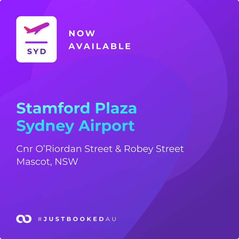
SOCIAL MEDIA TEMPLATECreative direction of all social media templates to use bold colours, a distinct vector style to cut through user's news feeds and competitor's corporate blue and red branding.
|
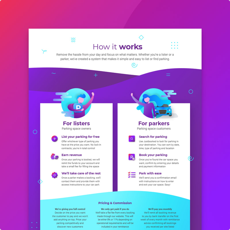
SALES FLYERCreative direction of all marketing collateral to maintain brand consistency across offline and offline communications.
|
UI Design
DESIGN SYSTEM
Once I developed a new brand look and feel, I converted these to Figma master components to build out a new design system. I briefed the devs on the styling then worked closely with my UX team to apply the master components to all desktop and mobile screens. See below style examples for colours and icons in the design system.
|
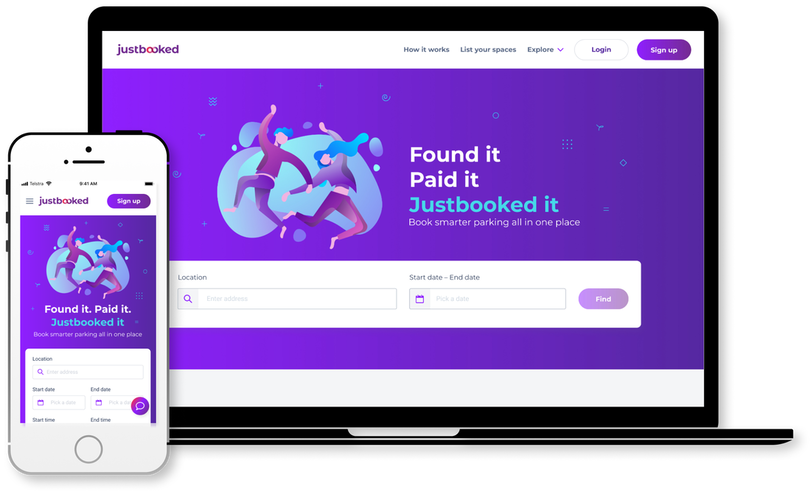
Above: Justbooked homepage UI design
|
INTERACTIVE PROTOTYPEOnce the Start and End Time had been removed from the wireframes, I mocked the UI design as an interactive prototype and led a final stakeholder walkthrough. I did a dev handover per user flow so the devs could apply the CSS at the same time I reskinned each flow and continued this process til all UI screens were done.
|
Outcome + Results
RESULTSIn 3 months, our teams (UX, tech, CX, operations, sales, accounting, marketing) were able to design, build and launch a new aggregator website with booking and payment functionality, simple 'My Account' section with a newly developed brand that has cut through amongst competitors.
|
INSIGHTSAlthough time was limited for early research and testing to validate features, it allowed the project team to build quickly, soft launch, then test – making it a live, iterative process. Post launch feedback confirmed that users were confused by the combined Start and End Date calendar picker, so I reverted this to separate calendar pickers – see home.
|
RECOMMENDATIONSPost launch – collate data and feedback (parkers and listers), prioritise bugs, address features that were descoped and create a feature prioritisation list based on customer feedback. Present recommendations to senior stakeholders with realistic timeframes and define clear measures of success.
|
Like my work? |
