|
WHAT IS 'BURN'?BURN is an on-the-go, junk food / workout calculator, which provides users with a side by side comparison of junk food vs exercise. It allows users to make informed decisions about food they're about to consume and answers the common question: how much exercise do I need to do to BURN those calories?
|
USER INTERVIEWS
|
To gain a greater insight to see how people felt towards food and fitness, I interviewed people of different ages, gender, occupation and levels of fitness. Here are their main take aways:
|
RICHARD
Manufacturing Team Leader"Exercise is more for my mind. If my mind is ok, then my body will follow."
|
CHANTELLE
Stay at Home Mum
"If I had more time away from my kids, I'd exercise more."
|
ASHLEIGH
Junior Receptionist"Now that I'm working towards something, I feel good."
|
PAPER PROTOTYPE
The paper prototype explores a linear user flow from landing page to food item (more info) page.
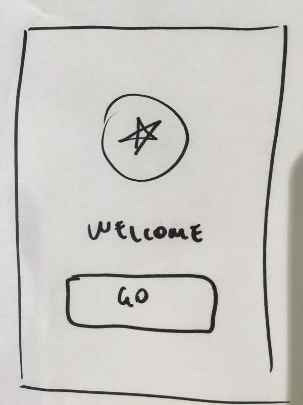
Landing Page
Screen 1 |
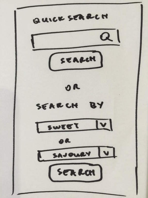
Quick Search
Screen 2 |
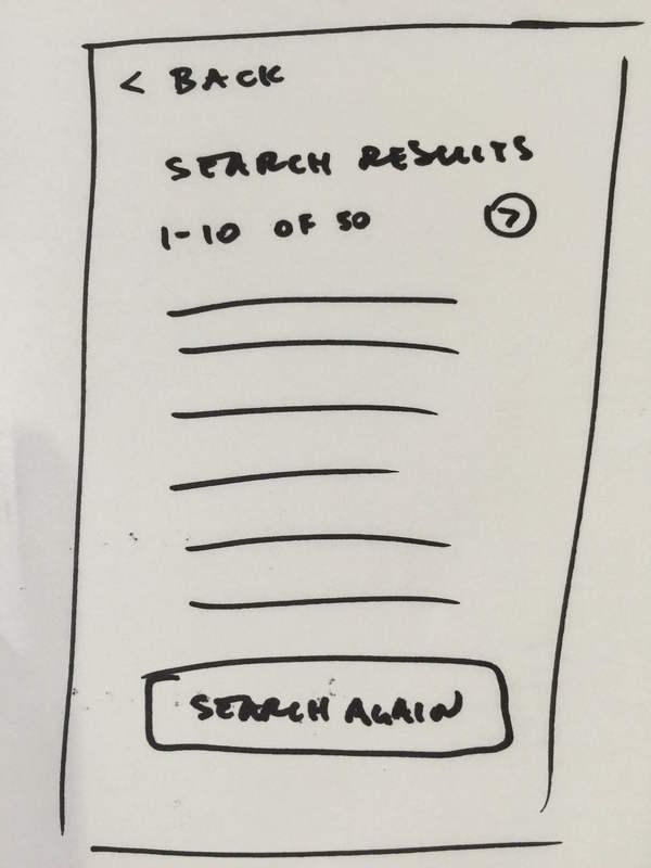
Search Results
Screen 3 |
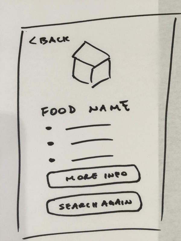
Food Item (summary)
Screen 4 |
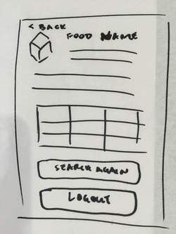
Food Item (more info)
Screen 5 |
WIREFRAMES
|
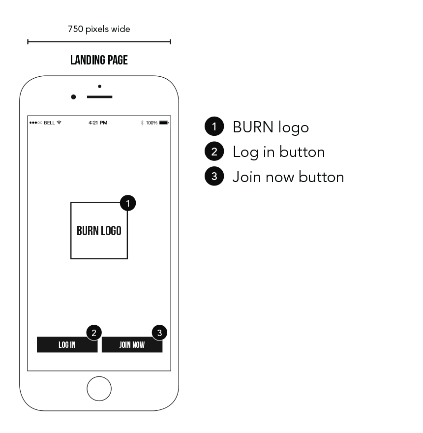
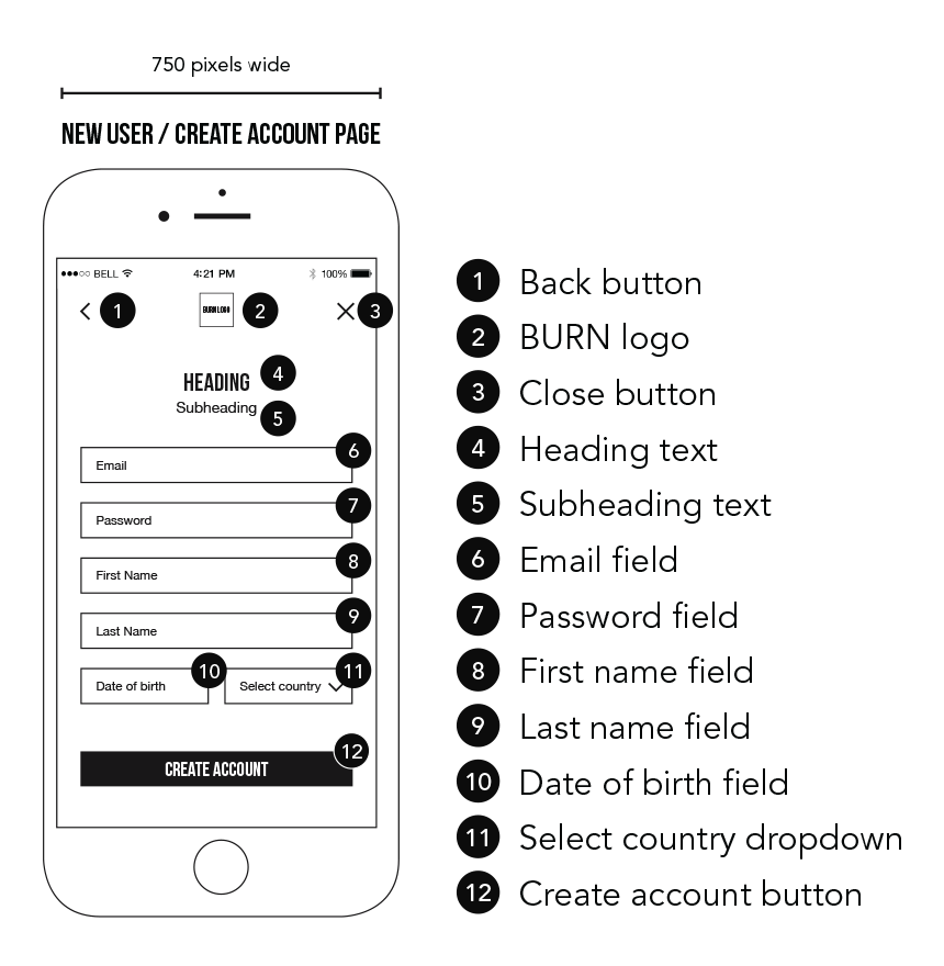
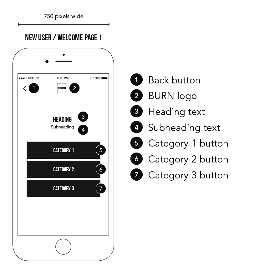
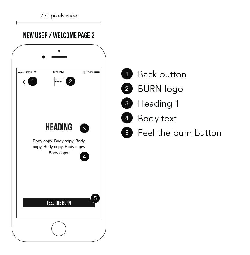
By synthesising the results from the user feedback, I iterated the screens by adding a few welcome screens which allows users to customise their experience, added a quick tutorial for new users and simplified the search page. User feedback revealed 2 search fields were confusing. Here are a few annotated wireframes.
|
|
|
|
|
MED-HIGH FIDELITY PROTOTYPE
|
Using Invision, I created a medium fidelity, interactive prototype. I kept the colour palette mono. Colour and a final logo will be added at the high fidelity prototype stage. I also used a friendly tone of voice and language related to fitness to tie in with the whole concept. Here are just a few screens.
|
Landing Page
Screen 1 |
New User / Create Account
Screen 2 |
How Active Are You?
Screen 5 |
Search
Screen 7 |
Search Results
Screen 8 |
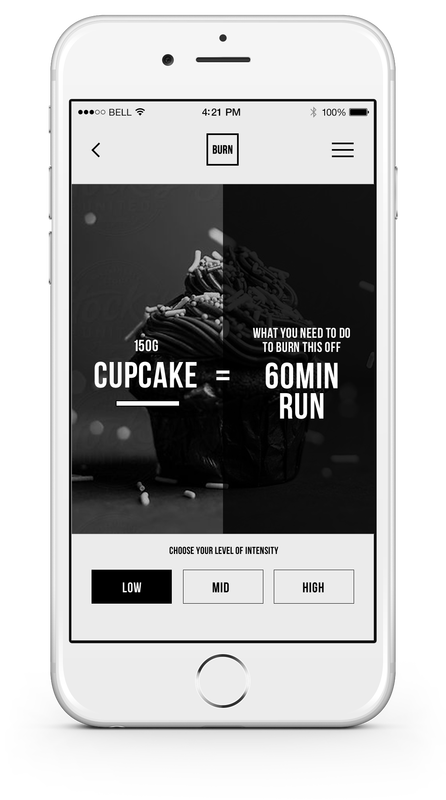
Calculate Calories
Screen 9 |
BURN LOGO DEVELOPMENT

Version 1
|
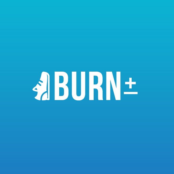
Version 2I tried blue as it reminds me of the sky and outdoors. I used subtle graphic elements, a plus symbol - intake of calories, minus symbol - calories being burned, sneaker icon - exercise.
|
Final
|
HIGH FIDELITY PROTOTYPE
|
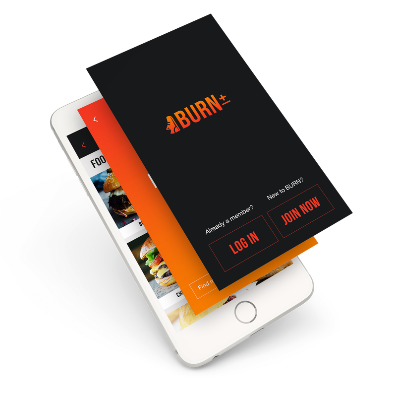
Final colour palette was chosen as it contrasts well with the background colour so every CTA would be easily recognisable to the user. Based on user testing and feedback, I revised the screens to simplify and improve usability. Here are several screens of the high fidelity prototype. Note: Not all screens are shown.
|
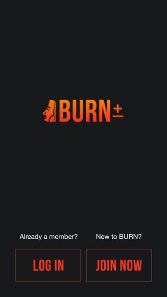
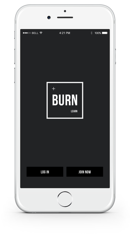
I used the orange/red logo colour as a visual cue for CTA buttons and contrasts well with the black background.
Screen 1 |
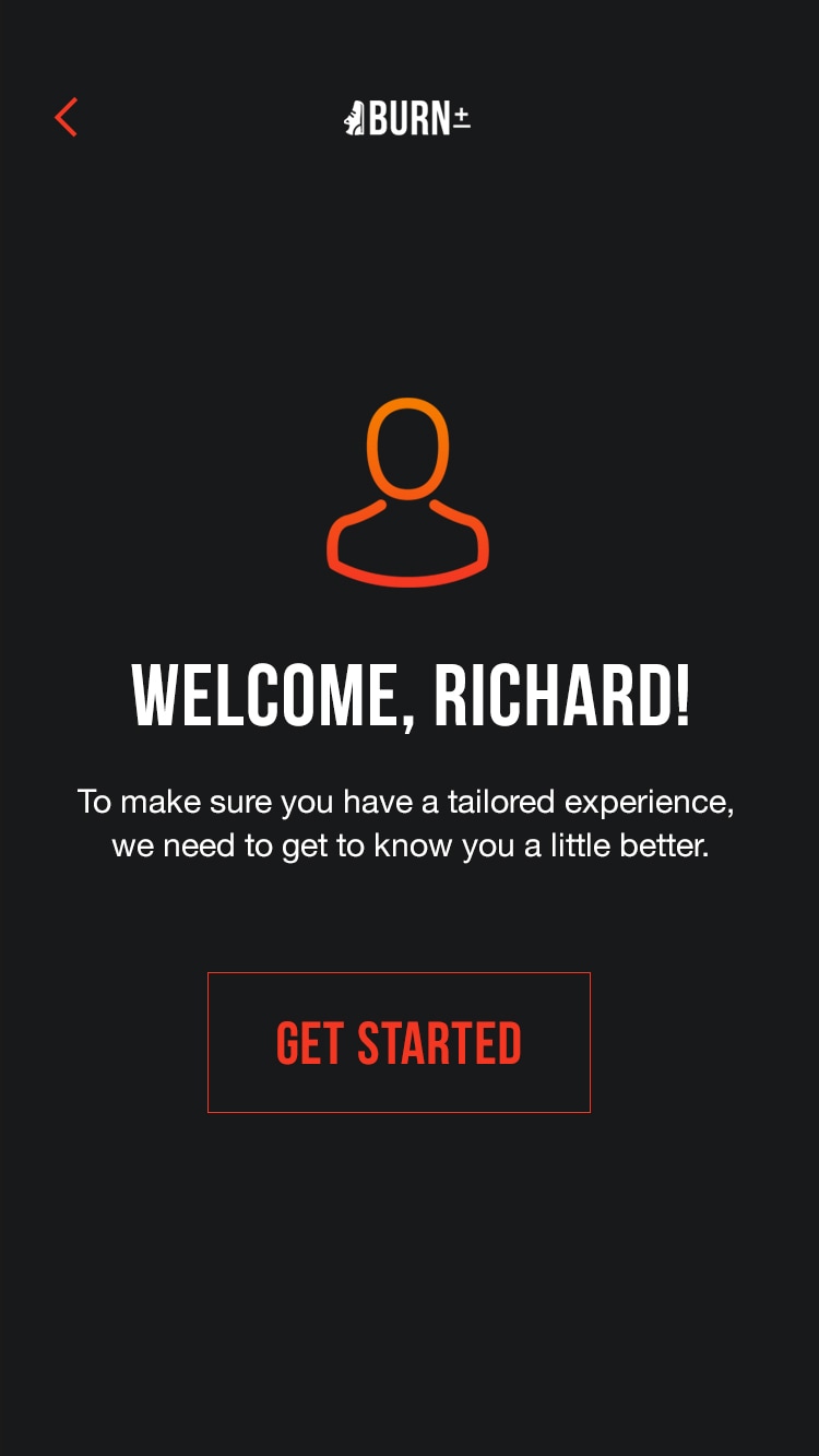
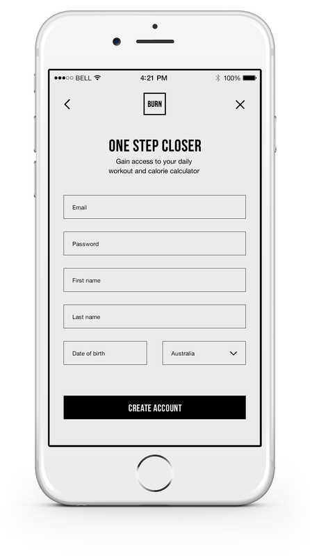
After new users create a new account, welcome screens allow them to personalise their experience.
Screen 4 |
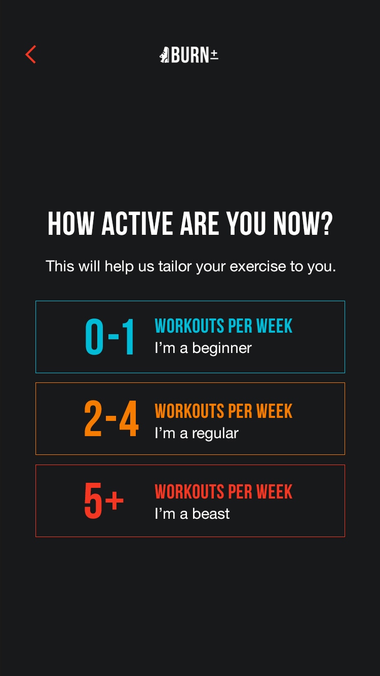
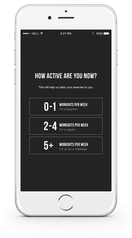
Customisation in their level of fitness allows users to have a more tailored search. 3 different colours represent each level of fitness.
Screen 8 |
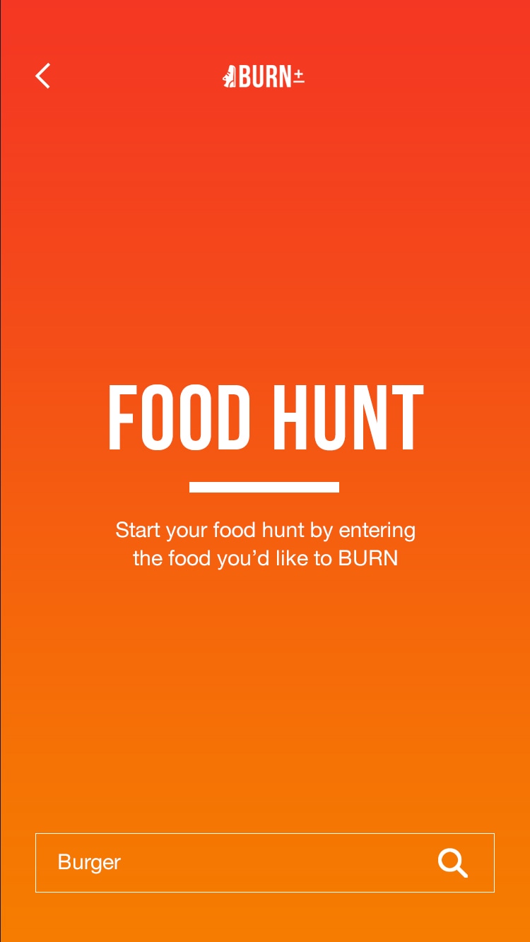
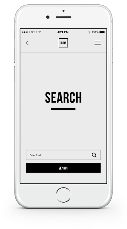
A simple, clear search page with brief instructions on what to do, makes the user experience easy to understand.
Screen 10 |
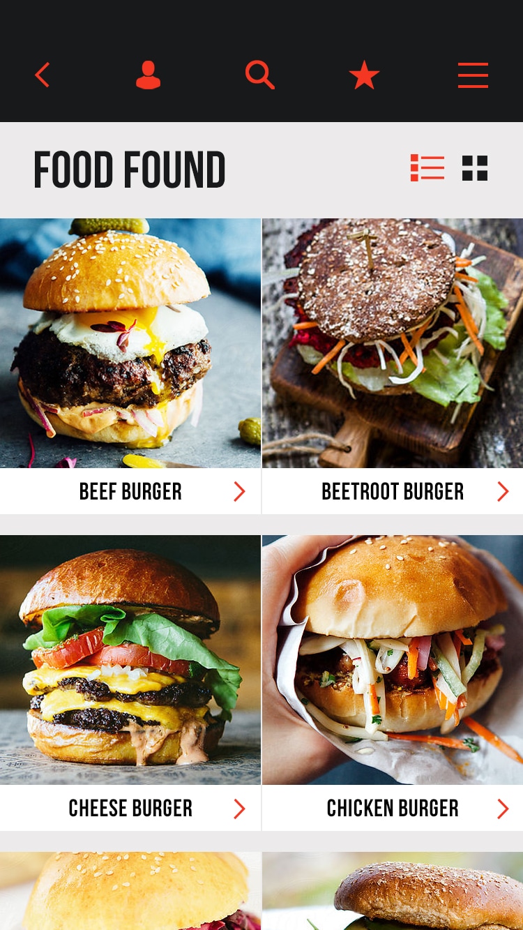
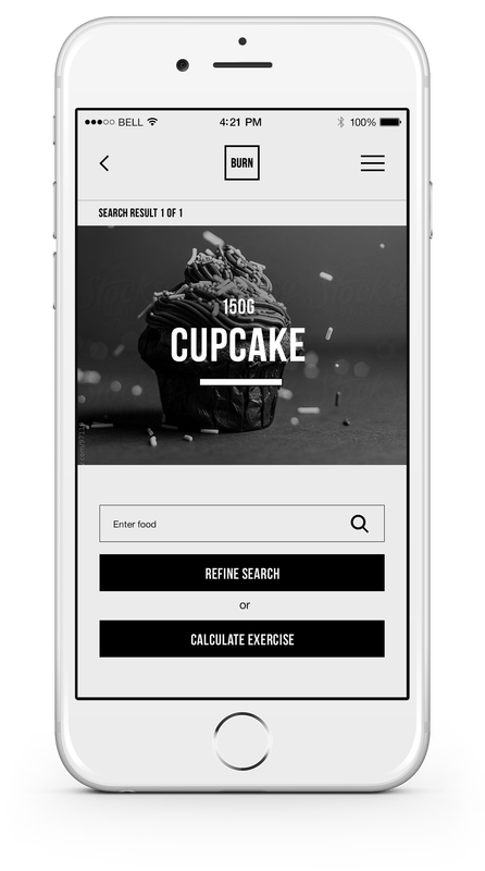
Based on user feedback, users wanted to see their food images large saving time on reading a list view, which is also a view option.
Screen 13 |
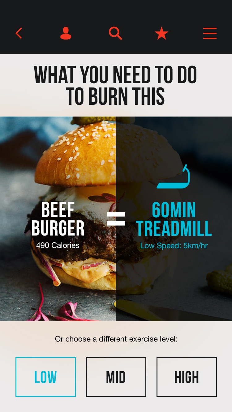
Users are reminded of the blue to represent low level fitness in the welcome screen, which is now a visual cue for the user.
Screen 15 |