ERMI
  • WORK
    • Justbooked Website
    • Skye Mastercard
    • Woolworths Q-Tracker
    • Visual Design
  • ABOUT
  • WRITING
  • LINKEDIN
PRODUCT LAUNCH

SKYE

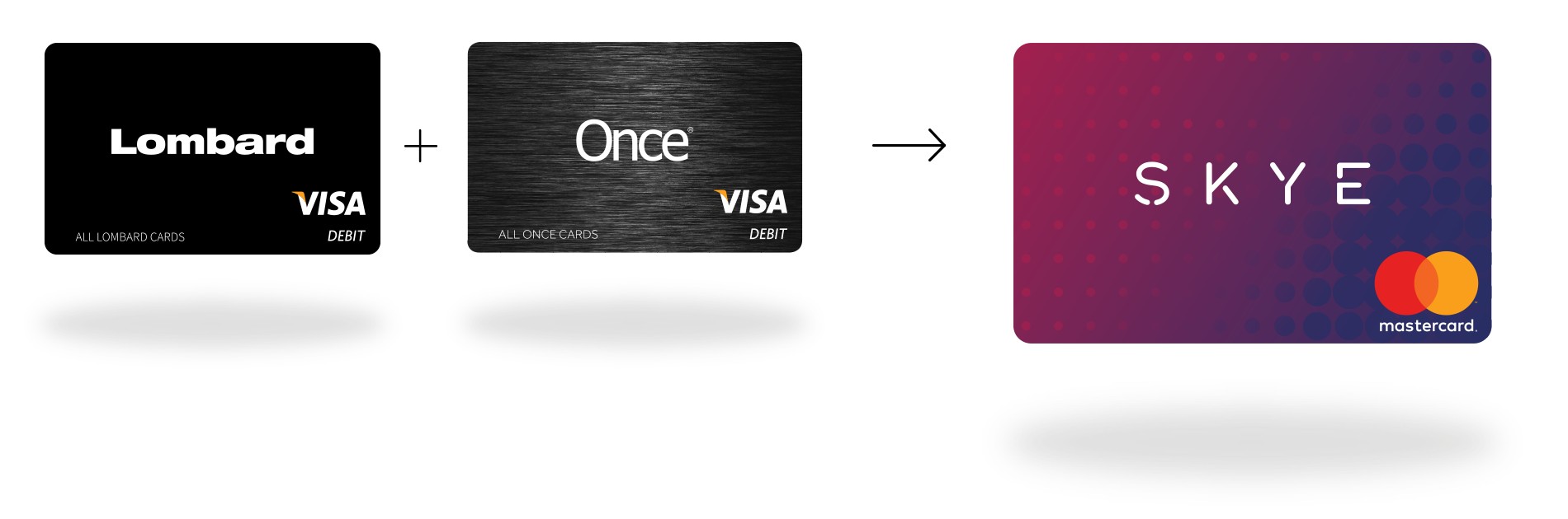
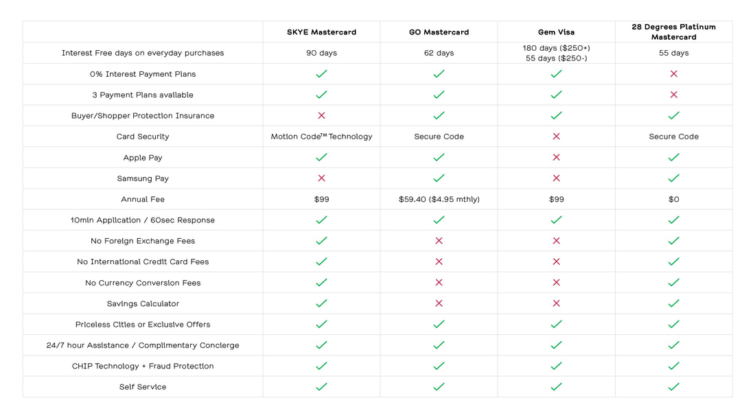
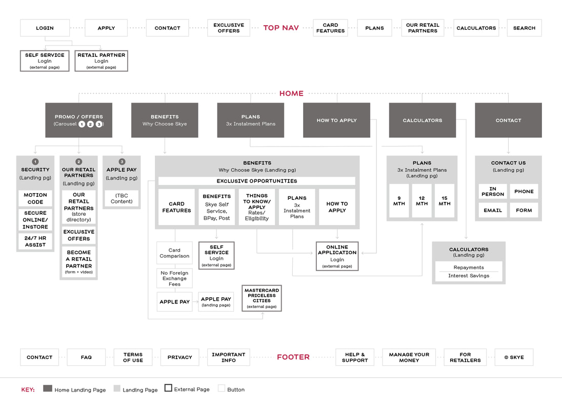
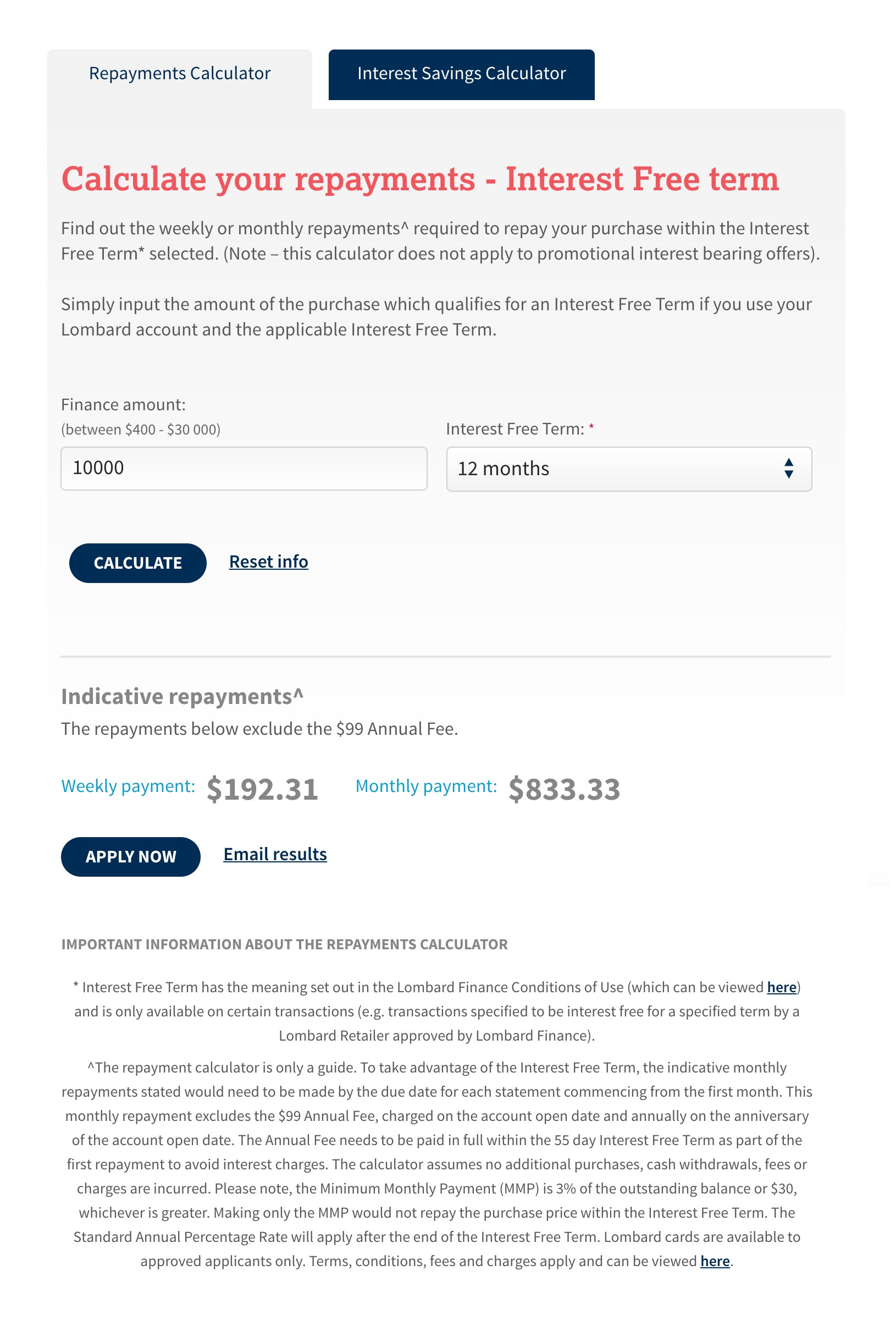
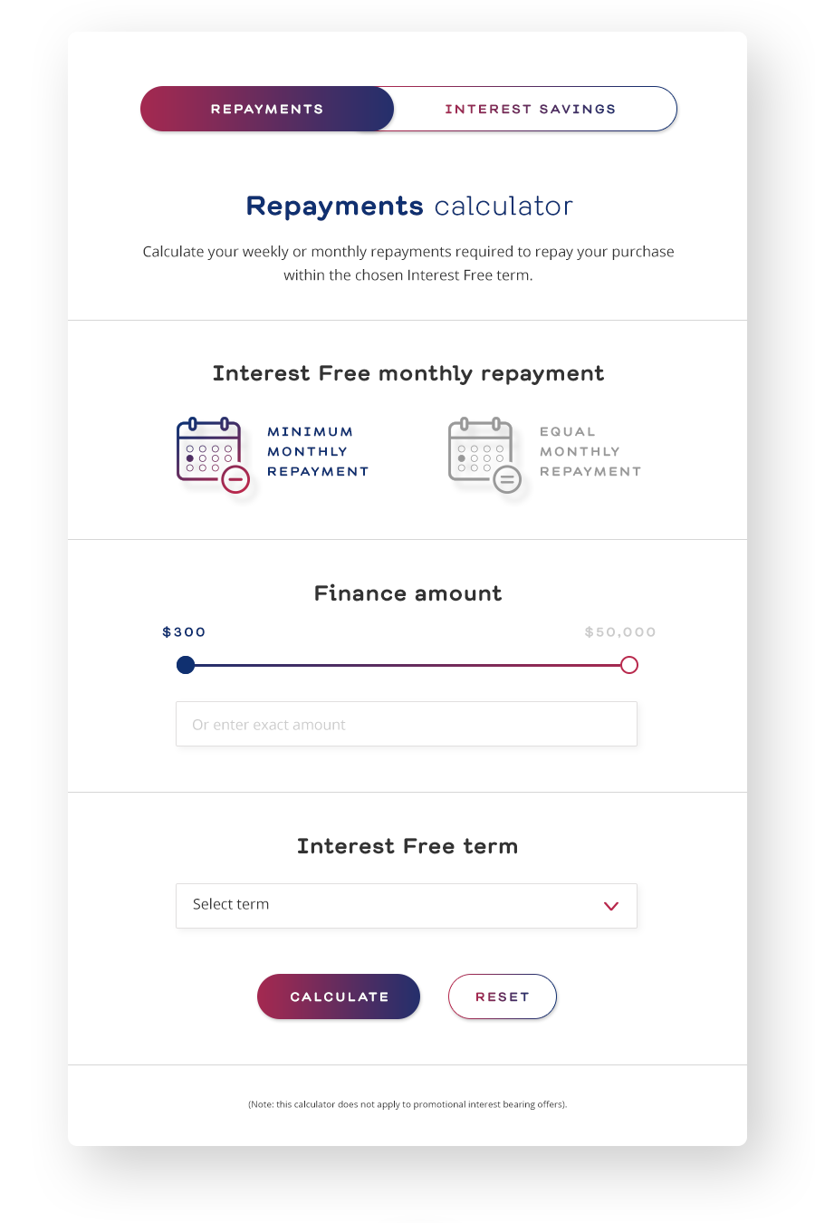
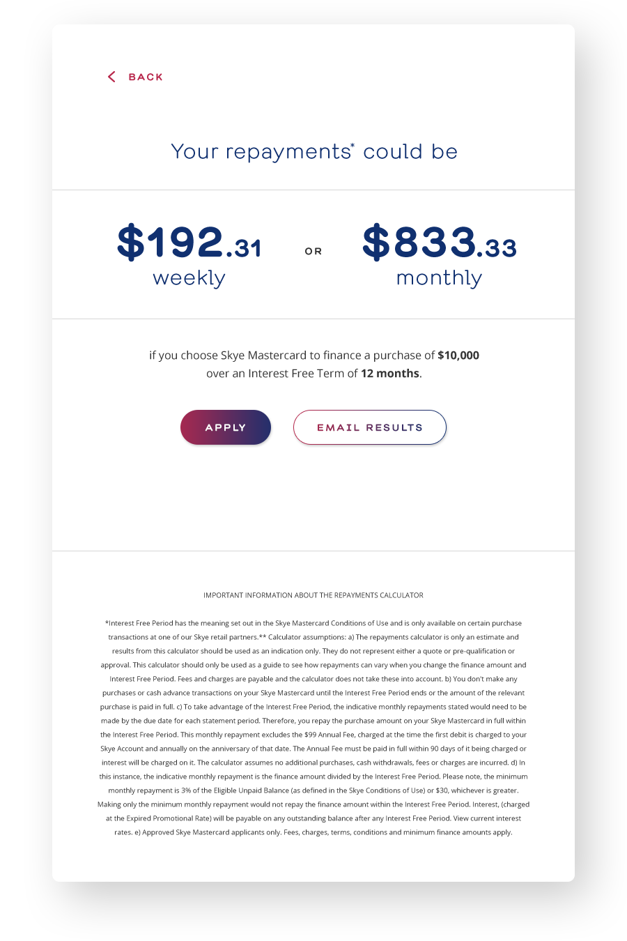
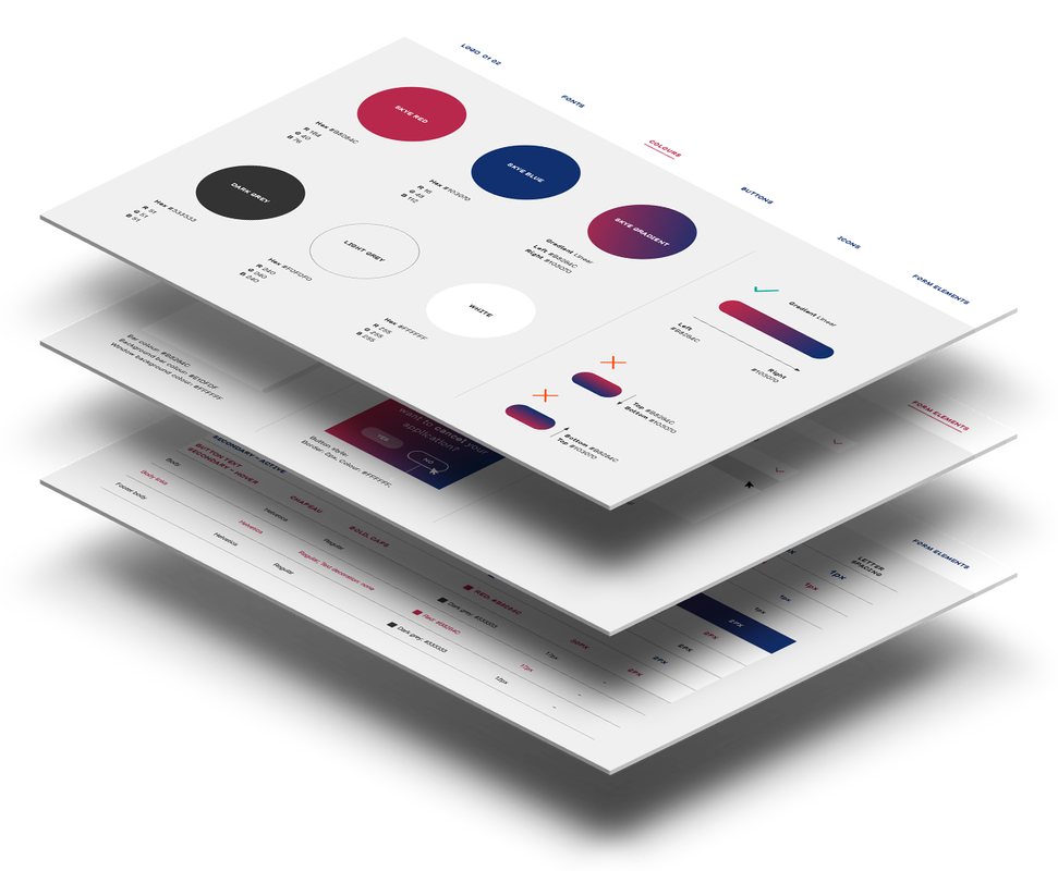
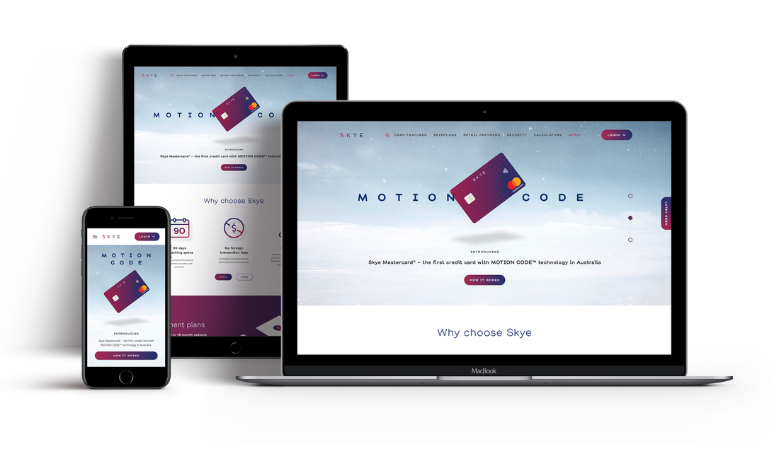
The Skye Mastercard product launched in July 2018, where I led the UX/UI design, creative and branding across every customer touchpoint. Due to time constraints, here are just a few solutions I provided to improve its product features.
view website

PROBLEM

Skye Cards
To launch the new Skye card successfully, the business needed to migrate 2 existing cards products and encourage existing and new customers to upgrade to Skye. The challenge was to make minor improvements across every customer touchpoint, educate customers and train sales about the new card, create an easier application and to encourage spend across all Skye retailers in 12 months.

RESEARCH

Competitive Analysis

I conducted a competitive analysis of the key Skye card features and compared it to its competitor's websites features to see how they compared to Skye.

My recommendation would be to ensure Samsung Pay is available to Skye customers. Based on researching various websites, customers expect both Samsung and Apple Pay as standard payment options.
Skye Competitive Analysis

Site Map

Here's an earlier version of the Skye website site map. The business requested for the main key functions to be displayed in the top menu. Based on customer feedback, they felt it was easy to find what they were looking for when the main functions were displayed in the top menu and not hidden in a hamburger menu. 
Skye Site Map

SOLUTION

To solve the problem of making it easier for customers to apply, the calculator was a popular and important function that was used frequently by customers before they decided to apply online.

Improve the Calculator

The main improvements I made were to the UI. Minor improvements to the information architecture guided customers through each step of the calculator, making it easier to use.
Lombard Calculator

Before

The previous calculator page was content heavy, the side by side form elements caused users' eye tracking to have a zig zag pattern, and the weekly and monthly repayments should be more prominent.
Skye Welcome EDM

After - Calculator screen

I replaced the tab function with a toggle, reduced the copy, improved the information architecture by separating each step by row, so each action is clear as you scroll and I used icons to make important functions stand out.
TRY THE CALCULATOR
Skye Welcome EDM

 After - Results screen

I edited the copy on the calculator results page so it sounded more conversational, enlarged the weekly and monthly amounts to make it stand out, as this is important information for customers in deciding how much they can borrow.
Skye Digital Assets Style Guide

SOLUTION

Create a Digital Assets Style Guide

Another problem that needed to be solved was ensuring brand and styling consistency for the Skye brand. To solve this, I created a mini 8 page digital assets style guide for the team of developers, which served as a design system overview for the online application. I included Skye colours, font styling, gradient rules, icon asset library examples, hover states, error text, progress bar, modal and dropdown styling. The internal Testers used this guide during usability testing.
VIEW STYLE GUIDE

INSIGHTS

Next steps

Skye Cards
When minor functionality improvements were made to the website, dealer portal, and application, it increased sales and improved customers' experiences. With more testing, insights from customer feedback and iteration, it will inform the business on which touchpoints can continue to be improved to ensure a positive customer experience.
View Website

LIKE MY WORK?

GET IN TOUCH
CONNECT WITH ME
© COPYRIGHT 2025. ALL RIGHTS RESERVED.
  • WORK
    • Justbooked Website
    • Skye Mastercard
    • Woolworths Q-Tracker
    • Visual Design
  • ABOUT
  • WRITING
  • LINKEDIN