Overview
CHALLENGERedesign and build a new online application for new trading customers wanting to open a new account.
|
ROLEI was involved from an end to end experience. I led the UX/UI design of the application redesign from initial research, information architecture, conducting stakeholder walk throughs through to dev handover and testing.
|
Solving the Problem

|
The current application is out of date in how it collects data from new customers and is in need of human centred design thinking and methodologies applied to it to make it a quick and easy customer experience.
|
Find a Solution
|
Above: Desktop wireframes of the homepage – iteration 4 of 4
|
ANALYSE DATAAs there was limited time to create site maps and user flows, I used the wireframe walk through to show the dev team the information architecture and how the user flows would work across desktop and mobile wireframes.
ResultsBased on tech feedback that building a Start and End Time couldn't be built by launch, I removed this functionality, kept Start and End Date, then led a final walk through with senior stakeholders for final sign off to start the build of the website.
|
Stakeholder FeedbackTo test the functionality more accurately, Woolworths was chosen as the sole focus for launch. By narrowing the focus and now building the tool within the Woolworths website meant teams could focus testing and collate customer feedback for the single site and gather more accurate data.
|
|
Above: Desktop wireframes of the homepage – iteration 4 of 4
|
GATHER INSIGHTSAs there was limited time to create site maps and user flows, I used the wireframe walk through to show the dev team the information architecture and how the user flows would work across desktop and mobile wireframes.
Key take awaysBased on tech feedback that building a Start and End Time couldn't be built by launch, I removed this functionality, kept Start and End Date, then led a final walk through with senior stakeholders for final sign off to start the build of the website.
|
Stakeholder FeedbackTo test the functionality more accurately, Woolworths was chosen as the sole focus for launch. By narrowing the focus and now building the tool within the Woolworths website meant teams could focus testing and collate customer feedback for the single site and gather more accurate data.
|
|
Above: Desktop wireframes of the homepage – iteration 4 of 4
|
USER INTERVIEWSAs there was limited time to create site maps and user flows, I used the wireframe walk through to show the dev team the information architecture and how the user flows would work across desktop and mobile wireframes.
ProcessBased on tech feedback that building a Start and End Time couldn't be built by launch, I removed this functionality, kept Start and End Date, then led a final walk through with senior stakeholders for final sign off to start the build of the website.
|
|
Above: Desktop wireframes of the homepage – iteration 4 of 4
|
AFFINITY MAPAs there was limited time to create site maps and user flows, I used the wireframe walk through to show the dev team the information architecture and how the user flows would work across desktop and mobile wireframes.
InsightsBased on tech feedback that building a Start and End Time couldn't be built by launch, I removed this functionality, kept Start and End Date, then led a final walk through with senior stakeholders for final sign off to start the build of the website.
|
ThemesTo test the functionality more accurately, Woolworths was chosen as the sole focus for launch. By narrowing the focus and now building the tool within the Woolworths website meant teams could focus testing and collate customer feedback for the single site and gather more accurate data.
|
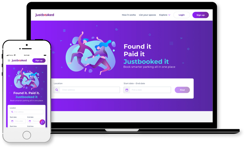
FEATURE PRIORITISATIONThe link icon conveys connecting users with the best parking deals. 'Justbooked' is straightforward and describes the service.
|

COMMENTSVector logos, shapes and illustrated scenes define the playful look and feel of the Justbooked brand.
|
COMPETITOR ANALYSISThe link icon conveys connecting users with the best parking deals. 'Justbooked' is straightforward and describes the service.
|

CARD SORTVector logos, shapes and illustrated scenes define the playful look and feel of the Justbooked brand.
|
InsightsTo test the functionality more accurately, Woolworths was chosen as the sole focus for launch. By narrowing the focus and now building the tool within the Woolworths website meant teams could focus testing and collate customer feedback for the single site and gather more accurate data.
|
Wireframes
Once the wireframes had been handed over to the dev team, my next step was to build out the Justbooked brand, create a new Figma Design System, develop a UI look and feel and apply it to the desktop and mobile screens.
Based on simple brand logo assets that were supplied by an agency, I had to further develop all other brand elements, including the Justbooked look and feel, tone of voice, defining the visual hierarchy of heading body copy fonts, form elements and rules, creating colour swatches, icons, vector scenes and worked closely with my UX team to roll out all UI elements across all desktop and mobile screens.
Based on simple brand logo assets that were supplied by an agency, I had to further develop all other brand elements, including the Justbooked look and feel, tone of voice, defining the visual hierarchy of heading body copy fonts, form elements and rules, creating colour swatches, icons, vector scenes and worked closely with my UX team to roll out all UI elements across all desktop and mobile screens.
DESKTOPThe link icon conveys connecting users with the best parking deals. 'Justbooked' is straightforward and describes the service.
|
MOBILEVector logos, shapes and illustrated scenes define the playful look and feel of the Justbooked brand.
|
UI Concepts
Once the wireframes had been handed over to the dev team, my next step was to build out the Justbooked brand, create a new Figma Design System, develop a UI look and feel and apply it to the desktop and mobile screens.
Based on simple brand logo assets that were supplied by an agency, I had to further develop all other brand elements, including the Justbooked look and feel, tone of voice, defining the visual hierarchy of heading body copy fonts, form elements and rules, creating colour swatches, icons, vector scenes and worked closely with my UX team to roll out all UI elements across all desktop and mobile screens.
Based on simple brand logo assets that were supplied by an agency, I had to further develop all other brand elements, including the Justbooked look and feel, tone of voice, defining the visual hierarchy of heading body copy fonts, form elements and rules, creating colour swatches, icons, vector scenes and worked closely with my UX team to roll out all UI elements across all desktop and mobile screens.
LIGHT THEMEThe link icon conveys connecting users with the best parking deals. 'Justbooked' is straightforward and describes the service.
|

DARK THEMEVector logos, shapes and illustrated scenes define the playful look and feel of the Justbooked brand.
|
UI Design
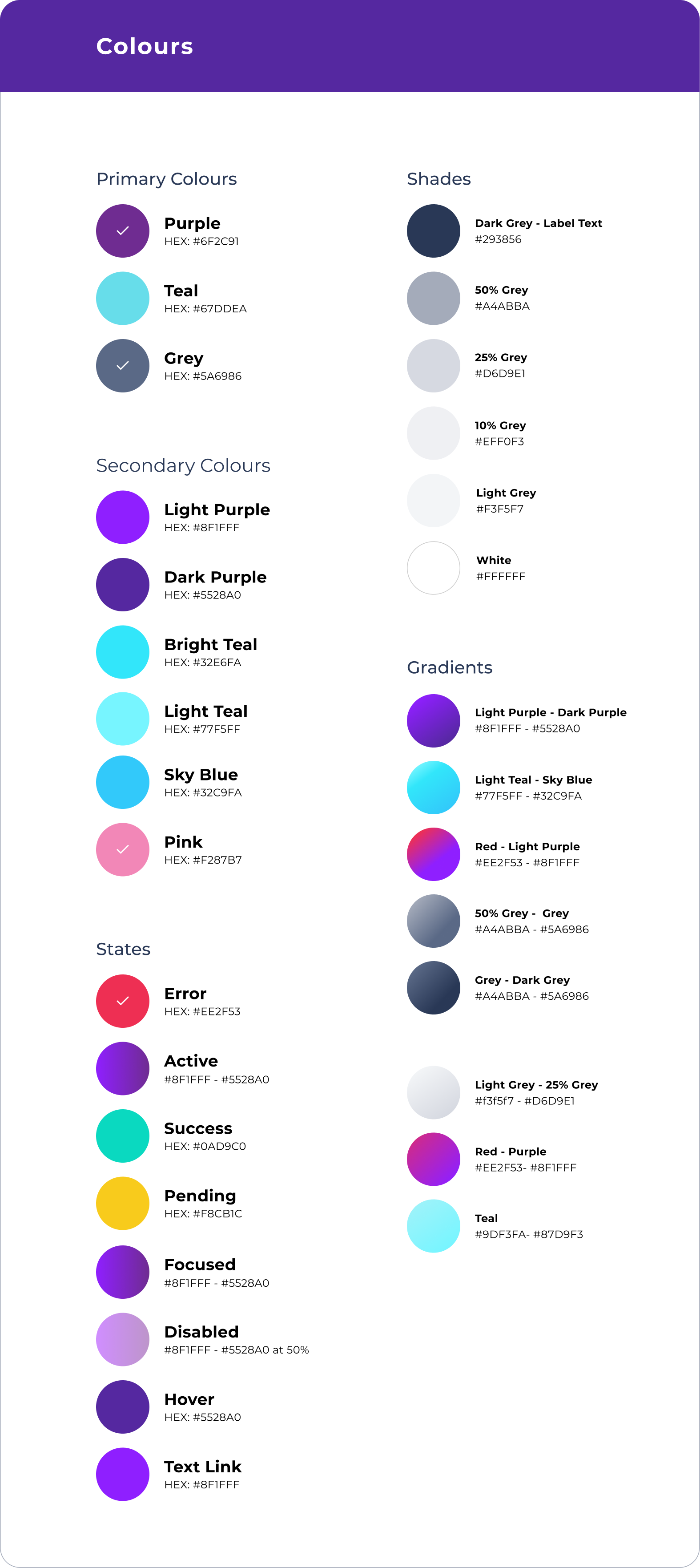
DESIGN SYSTEM
Once I developed a new brand look and feel, I converted these to Figma master components to build out a new design system. I briefed the devs on the styling then worked closely with my UX team to apply the master components to all desktop and mobile screens. See below style examples for colours and icons in the design system.
|
|
|
Above: Justbooked homepage UI design
|
INTERACTIVE PROTOTYPEOnce the Start and End Time had been removed from the wireframes, I mocked the UI design as an interactive prototype and led a final stakeholder walkthrough. I did a dev handover per user flow so the devs could apply the CSS at the same time I reskinned each flow and continued this process til all UI screens were done.
|
Outcome + Results
RESULTSIn 3 months, our teams (UX, tech, CX, operations, sales, accounting, marketing) were able to design, build and launch a new aggregator website with booking and payment functionality, simple 'My Account' section with a newly developed brand that has cut through amongst competitors.
|
INSIGHTSAlthough time was limited for early research and testing to validate features, it allowed the project team to build quickly, soft launch, then test – making it a live, iterative process. Post launch feedback confirmed that users were confused by the combined Start and End Date calendar picker, so I reverted this to separate calendar pickers – see home.
|
RECOMMENDATIONSPost launch – collate data and feedback (parkers and listers), prioritise bugs, address features that were descoped and create a feature prioritisation list based on customer feedback. Present recommendations to senior stakeholders with realistic timeframes and define clear measures of success.
|